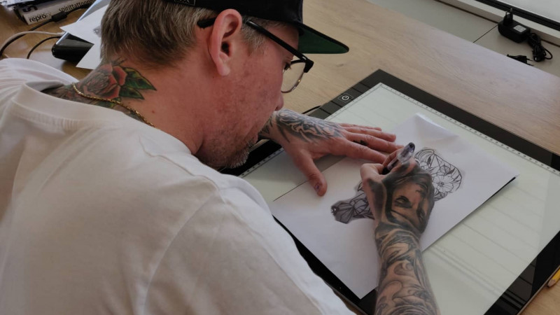
During my second semester as a multimediadesigner, we were tasked to work together with a company to create a wordpress solution for them, which also required us to work with the various elements we'd worked with during the semester.
For this project there was no background knowledge beforehand, as such, a lot of research and development had to be done. To begin with, we worked with the company to find out what we wanted our target audience would be. We then followed that up by trying to create a "general" question sheet that we used to interview various people in the target audience, in order to find out which direction we needed to work towards for the content that was most important to the visitors of the site. This also gave us insights that we hadn't previously thought about.
Once that was complete, we started working on various wireframes to find the best possible layout for the visitors. We interviewed people while showing them wireframes for different parts of the website, to find what they considered best for both information and aesthetics, to help keep them engaged in the content. After the tests, design was the next natural step. We talked with Ink Factory to find out what they wanted to portray themselves as and took inspiration from how their building and flyers looked, to create a red thread between it all.
